Sunday, 30 September 2012

Tile Selections

With our last house I had such a hard time picking tiles, I just didn't understand which tiles went on the floor and the same for the walls. Looking back I got the main bathroom sooo wrong and our ensuite was pretty close to what people are still picking today. It had bits of stone like mosaics, which are still popular today and it did age really well, main bathroom not so much.

This time I want simple and classic, no strips of mosaics, it's just not for me. I have looked at enough images now to know that I repeatedly like bathrooms that are mostly white with grey, so no dark tiles for me on the walls either just white.

These are some of the images I love.


We had been down to view M's tile studio and on our last visit had decided on our wall and floor tile with no features so for our appointment I felt it was going to be straight forward. We were lucky enough to have the same sales lady for our appointment that we had talked to previously, she was great.

I had picked out a 600x600 cararra marble look like in porcelain, it was drop dead gorgeous. Then she went off to get something to start filling out the details of our choices and came back and told me that she just realised that M don't do 600x600 in the shower areas as it is hard to get the fall right for drainage. Broke my heart it did. I didn't want different tiles in the showers as they are only small areas and I didn't think it would look any good, I like simple. I have since read that while many people do use these tiles in showers, it does require a lot of cuts and can be tricky to get the fall right.

So we had to pick another floor tile. I am still really happy with my choice and it will be easy to keep clean too.

So we went with a darkish grey on the floors for all wet areas and powder room with a matching grout in a 600x300 size.

For the walls we went with a rectified white gloss ceramic as the whitest porcelain was too creamy. This will go on all walls except in the powder room. This is also 600x300.

colours a little off - phone pics  Floor tile, wall tile and subway tile.

closer shot of floor tile with subway tile.


On one wall of the main bathroom behind the freestanding bath will be all white subway tiles and on the main shower wall in our ensuite will also be subway tiles. These are 200x100.
 Kinda like this pic.


In the powder room we will be having something a little different but still in white. The back wall with the vanity on it will have white round penny tiles. These were similar to the ones Danni and Dan used on the block. I couldn't get that bathroom out of my head and I'm so happy we are having them too. It's different but still nice and simple white.


When done they should look like this.


While I'm aiming for a classic type of bathroom, I am working with what is available with our project builder...so we have kept all of the bathroom fixtures provided by M in their designer range. This means they will have a much more modern look to those above and obviously the grey floor tile is quite modern but with the touch of Subway tiling there is also still some classic touches...it is a mish mash of styles but I think it will work well. A little old a little new.

 What do you think?


Tash x


Friday, 28 September 2012

Our Girls

Our two daughters are excited about living out of town and my youngest is looking forward to having a flat stretch of concrete to rollerskate and ride on. They are a little tired of the numerous trips out to the block just to stare at an empty plot of land but now there are things happening they are a little more keen to come and check thngs out.

These were some shots I took near our block recently, behind them a lovely multi level weatherboard house is being built.


We also have two other "daughters" in our house Cavalier King Charles, who will be coming along as well. Not sure how they will cope in the new house. We will be having rural fencing which means you can see into everybodys backyards and I know our new neighbours have a dog, hopefully they all get along without too much fuss.

Gracie


Bella
Hanging out for life to return to normal, I think the girls are over "house talk" too but I feel very blessd to be in a position to own our own house and not have to rent for much longer. Just going to try and enjoy every moment and not stress the small stuff, it's not often you get to build a house.
Tash x


Thursday, 27 September 2012

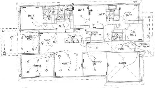
Electrical

Our electrical appointment was back on the 22nd and 23rd of May and we had to travel from Toowoomba to the Gold Coast for the appointments so it's a little hard to remember what we did but I won't forget the cost in a hurry! I knew it wouldn't be cheap going by other blogs but I was still hoping for it to go better (cheaper) than it did.

The guy doing our appointment was at times a little pushy on things and it was my least favourite part of the building process so far. I think overall we went about $2000 over what we were hoping and we deviated from what we had prior planned that we wanted. My advice is to stick to what you planned and don't be swayed from it if you really want to stick to your budget.

It looks a little dodgy as my husband drew it up but you get the idea.


After deciding we would do all our down lights after handover we ultimately ended up with LED down lighting provided through M in all of the living areas and outdoor areas. This was not what we were planning to do but now I am glad it will be done and not another item to add to the long list of what needs to be done after handover, with no worries of tradies leaving damage. When we actually looked into a little more later on we didn't feel we would have saved that much by getting it done afterwards.  They are energy efficient and under a great warranty. We also opted to go with white as we didn't want to see silver round dots all over the ceilings, this way they are much less noticeable and silver was probably a little too modern.

We ended up with 40 of these.


There will be fans in the family, rumpus, outdoor and bedrooms but these will be done after handover so there will just be battens till then. These too will be white. This he tried to push for us to buy through M and didn't even really ask just assumed we would be purchasing through them and went ahead and started adding them to the price until I put my foot down.

We need to buy pendants or ceiling lights for the kids activity room, dining, entrance, sitting room and bathrooms and also three for over the kitchen island bench. We were also offered their range of pendants but I didn't even bother looking as the couple I saw were way too modern.

We got a few extra double power points and tv and telephone points added but looking at the plan now I am wondering what we were thinking about some of the placement of these things. I don't think we really planned well enough for this and I will admit we sat up the whole night right through til the morning talking about it just before the trip to the Gold Coast for our appointments and we still messed it up a bit. Sort of like a last minute all night study cramming session.

Really so much of this build is a little bit of a crazy mess lol! It's going to be quite a stressful adventure.

So far I have only purchased one pendant light but it is my most favourite thing I own at the moment and will be coming with me if we ever sell. It deserves it's own little post ;) Not sure where it will go yet. The only other item I know I definitely want is an outdoor fan like this.

Finding it hard to find anything I really like. Will keep looking and update if I purchase anything.

Tash x

* I should add we were unable to get downlights added to the under side of our overhead cabinets. The only ones they had were the triangle shaped silver downlights that sit outside of the cabinets, can't understand why they don't provide the other less obtrusive lights.


Upgrades


Aaah upgrades, they can take over if you're not careful and leave you well over budget. Once you get the must have items out of the way it becomes harder to decide what you should try and stretch to include and what should be left standard. Even now I can be heard moaning " we should have kept that upgrade it was only a little bit more for it". The problem is every upgraded item while on it's own can be just a couple of hundred dollars but add them all together and you have a hyperventilating husband haha.

As it stands we are over what I was hoping we would spend and it is entirely my fault. You think a little differently when you plan on staying in the house for a long time then I think you would if just building to live in for a couple of years, everything becomes a must have.

While we went over budget I think we got most of what we wanted and there are also a number of things we decided not to upgrade and have kept standard or left out altogether. I'm also loathe to admit we paid a few variation fees along the way, mostly due to my indecisiveness. My biggest tip for anyone going with a project builder is to add everything in at your studio appointments because it is easier to take them out then add them in later. My husband kept telling me this but really I just felt foolish upgrading things that while we wanted them we knew we most likely wouldn't go with. I should have just went with the feeling foolish. Take my advice, add as much wish list things into your quote at your appointments and save yourself the variation fees.

Okay so onto some of the things we upgraded.

* 9 foot ceilings, with internal doors, bi folds and french doors, front door upgraded in height to suit higher ceiling.

* Solar hot water system instead of gas.

* Cornices, architraves and skirtings to wider size.

* Roof pitch to 25 degree instead of 22.

* Recessed shelves in showers.

* Frontage is not standard, it is an upgrade.

* Grand outdoor room.

* Change of paint colour in kitchen, dining and family room.

* Panelled lining to the entrance ceiling and made it 3m high.

* Freestanding bath to main bathroom instead of standard.

* Upgraded the carpet to the gold range, upgraded underlay and upgraded from the standard floorboard range.

* Tiled kicks under bathroom vanities.

* Upgraded everything in the kitchen and butlers pantry...this needs it's own post, too many numerous things to list.

* Added built ins to the laundry.

* Added internal glass cavity sliders in sitting room and butlers pantry.

* Upgraded internal doors.

* Using weatherboard was a big upgrade as was the render.

* Upgraded Ceasarstone colour from standard range.


There were lots of little things but those are the main items. We also took out a couple of things...the glass splashback, mirror in powder room, all the kitchen appliances except the microwave and the hanging rails in our wardrobes.

We kept all the basins, showerheads and mixers in bathrooms standard as they are of a high standard.

If anybody building would like an idea on prices I'm happy to help.

Tash x

Wednesday, 26 September 2012

Promotion Package

Thought I would do a quick post on what M was offering as their promotion package at the time we signed up. We had an option of two different ones but chose the one that included things we were going to spend money on anyway.

* $5000 off the cost of the base house price.

* Steel frames.

* Colorbond roof.

* 1.5kw solar system.

The colorbond was what really sold us on this package as it was a must for us, tile is not that popular in our area and it was going to be around about $5000 extra without this promotion as they only provide tile as standard.

Monday, 24 September 2012

Floor plan with Minor Changes

In Qld they don't actually have a Grandview 37 available they only do up to a 36. So we changed the 36 to the Nsw 37.

Really all the difference between the two is the removal of a wir in bedroom two, then a change of position of the toilet and the adding of a basin making it into a powder room. We prefer this as it opened up the pantry where previously it was blocked by the toilet so now we can dump groceries straight from the garage without walking around to get to kitchen. It also now means we get a basin and cabinets in our second toilet, suited our needs much better than the wir.

All up with the changes it now becomes 39sq.


Here is the standard 37 Nsw plan flipped.


And here is our floor plan with some tiny changes.


The following changes were made to the Nsw 37 plan.

* Garage widened a tiny bit as I think when you pick the resort frontage it makes the garage a little smaller.

* Family room made bigger and sitting room made smaller and added some bulkheads.

* We made the porch deeper.

* Added on a grand outdoor room.

* By also picking the resort frontage it actually makes the whole house a tiny bit wider.

* We have added in a bit to the family room to add a gas fireplace (technical terms here).


Doors and Windows

We change a few of the doors and windows from the original plan as well.

* Added bi folds to the family room instead of just windows.

* Took out the sliding doors to outdoor room in rumpus and instead added three windows to the northern side and french doors with side windows overlooking the backyard area.

* Took out the sliding doors in the bedroom to the outdoor area and added a single french door with side windows to the backyard instead.

* Upgraded the height of the windows in sitting room to match the rumpus room windows.

* Added internal cavity sliding glass doors to sitting room.

* Added an internal cavity sliding glass door to pantry.

* Made the bathroom window smaller.

* Added a window to garage.

* Added an internal door from the garage (can't believe this is not standard).

* Made the front door taller.

* As mentioned we also took out some corner windows from the resort frontage so we just have two simple square windows.

I think the windows and doors were the biggest change. We changed a lot of these to take advantage of the northern sun and so that the rumpus and our bedroom opened up out to the backyard.

We plan to have extra outdoor areas at the back outside the main bedroom and rumpus room and to also deck or concrete the area off the bi folds in the family room.

I should say that the front of the house faces west, all of the living room areas face North (yay), the backyard in east and the laundry side faces south.

Sorry, know that might be confusing but might be helpful for someone building this plan.

Tash x

Sunday, 23 September 2012

Exterior Colours

Well as my blog title suggests it will be grey and white. Simple and classic and not something I will get sick of too quickly as is my habit.

All of the weatherboard and render will be Dulux Milton Moon and any of the trims and doors will be Dulux Lexicon. The Lexicon was not our choice but M wouldn't allow us to use the shade of white we wanted, it couldn't even be Lexicon quarter.

Our windows are white aluminium, we toyed with the idea of wood out the front but because we face west decided we will already have enough upkeep without worrying about maintaining windows too.

The roof and guttering will be Surfmist Colorbond and the garage door will be Surfmist as well. Just realised I have never checked how the Surfmist looks with the Lexicon white, I know Lexicon is whiter so I hope it all goes alright together. You just can't check everything.

There will also be a little touch of stone to the bottom of the porch posts at the front although there is some confusion about what colour has been picked as it is not in our contract, this should be interesting.

Dulux Milton Moon

Dulux Lexicon


Crazy Stone

Surfmist Colorbond

Scyon Linea Weatherboard


Similar colouring
I just love the classic colouring in this last picture.

Friday, 21 September 2012

Craftsman Style Homes...Inspiration For Our Frontage.

I love Craftsman style homes, also called Arts and Crafts and Californian Bungalows. They are my most favourite style of house and I  would have loved to have gone with a private builder and built one.  But we decided to go with a project builder to get more size and inclusions for our money. Not sure after all our upgrades if it would have cost about the same with a private builder but with my husband travelling so much we were really just too time poor to sit down and draw up floor plans and get quotes. 


Rock Accents

Dulux House


Exposed Rafter Tails

Front Porch

So after checking out the frontages we were allowed to have with our plan, the closest one to have a little of this style was called Californian Bungalow. But I also liked a frontage for some of the other plans called The Resort which was not one of our frontages.  We asked M if they would allow us to have this frontage instead of one of the frontages assigned to our plan and luckily they gave it the go ahead. They really have been quite flexible about things.

This is the front elevation without changes.


We feel we kinda get a little bit of a craftsman feel while still keeping a little modernness as well.But we have made some changes to the look that differs from the above picture to give it a different feel.

 We have kept the parapet over the garage, this of course is a modern touch and not craftsman at all. We kept the front porch and actually made it deeper. We took out all the sticking out stone bits but kept the stone accents at the bottom of the porch. Kept the paned look windows but removed the extra corner bits on one of the front windows. The modern pivot door and sidelights have been kept but we have chosen a design that has a paned window look to it.  The rafter tails which are only out the front are staying, I love them and very craftsman. The front porch area will be decked. The biggest thing we decided to do was to build most of the house out of weatherboard, it was my must have. M uses Scyon Linea Weatherboard and it will be on most of the house, however it did prove to be an issue.

We wanted it to start from the ground to roof right around house except for the parapet over the garage, parapet at the side of house and the two pillars holding up the outdoor area, they were all to be rendered. But M uses a glass termite barrier around the slab which meant the weatherboard could not start from there, we would have to have a rendered bit running around the bottom underneath all the weatherboard...not the look we were after. To cut a long story short after many discussions about it the lovely lady looking after our house file talked directly to the engineers and they agreed to at least lowering the height of these rendered bits. So we still have to have the render bit running around underneath but it will not be as high and we will have more weatherboard.

While the frontage is not really a traditional Craftsman style home it does have a few little touches like the porch, rock accent, paned windows, rafter tails and weatherboard to make me happy enough. I am willing to live with the render running around the bottom as I really wanted a weatherboard home.

Here is our frontage.

Frontage and Northern Side


Back and Southern side but missing two windows in this elevation in the ensuite.

So that's how we tried to turn a modern project home into a home that has a tiny touch of craftsman about it. Hopefully it doesn't turn out too badly, I am a little nervous about what we have done.


Thursday, 20 September 2012

We have a Slab...and our first invoice.

Slab pour did not happen Tuesday which was so disappointing but we did end up having storms and heavy rain that night so it was the right thing to delay it. Didn't go out to the block Wednesday as Stu was home that night and I thought we could just go out together on Thursday.

Thursday afternoon Stu picked me up from work and said he suspected we have a slab as he had received an email and sms for an invoice for payment for slab. We headed out to the block and sure enough there it was. My first thoughts were it looked really high but nice and tidy and solid.

We both had the day off today so we headed back out to find someone just leaving the block. We now have a bin and they have scraped soil all around the slab and site. It looks so neat and tidy, very impressed.

We are still missing some bits from the slab, the front portico and back outdoor room will be concreted or decked after handover. Kind of wish we had done it all together but we thought we would wait as we haven't decided what to do with these areas yet.

It is now a bit of a wait til around the 8th to see any frames go up as there is a delay with those but it will give time for our slab to sit and cure nicely.

Where that that tall pipe is sticking up out the front is the edge of our portico.

Lovely clean site, don't think it will stay this way but still a nice surprise early on.

Tank is next door neighbours.

Bin and front portico pipe.


I hope we get to keep some of the lovely views that we get at the back.

Saturday, 15 September 2012

Slab ready for pouring....But....

Well the girls and I went out to check what had been happening since we last checked on Tuesday and everything is now in place for our slab pour on Tuesday but like my title says I had a moment of disappointment.

 I think we have positioned our house in the WRONG spot!!

The builder has placed it exactly where they have been asked to it just looks further back then I thought it would be. We are required to set it back 15m but we decided to set it back 17m to fill up some of the acre so we wouldn't be left with a huge expanse of just grass in the backyard but the neighbours actually got council permission to move their house forward which just makes our little house look even further setback and at this stage a little silly looking to me.

I think my husband and I got our wires crossed, I thought 17m from gutter but he is saying "no it was always 17m from the official start of our land boundary. Aaargh! As you can imagine I made a quick panicked call to my hubby, took some pics and of course he and the girls can't see what the problem is. I think it has left us with too small a backyard now and a massive front yard but whaddya going to do? What's done is done, it's not like you can just move it...it's a learning experience.

Looking at it in it's pre slab form it looks little to me and I can't imagine how everything fits on top of it, it's just like what everyone says and I bet it looks even smaller once they take the boxing away and because of the silly placement our block (1acre) looks so small now. Can't wait for framing, maybe things will look better.

We have slab pour due this Tuesday but we also have storms forecast for Monday and Tuesday, couldn't have planned it any worse really considering we have had literally no rain for months. Really you just have to have a giggle about it and go with the flow, it's going to rain and there are going to be things about this house that aren't quite what we were expecting them to look like but in the end it will all somehow come together.

You can kind of see how far back we are compared to neighbours and there is even more front yard still cut out of pic.

Add caption

Wednesday, 12 September 2012

New Caesarstone Supernatural Range

Has anyone seen the new marble inspired Caesarstone range? I noticed it a few days ago when searching for pics of our bench colour. When deciding on what to pick for our bench tops I was frustrated that most of the caesarstone range consists of speckled patterns when what I kept thinking was why don't they bring out a range that looks like marble? Well they must have heard me as they have done just that.

I rushed around Saturday morning trying to find a kitchen company open to pick up a sample but no luck. Had to wait till Monday afternoon before I could get my hands on a sample of the Carrina Frosty and it really is lovely. While not technically too late to change our selection to this, I decided to stick with my original choice as I was worried it was a little to bone coloured against my other selections but for anyone who wants marble but are not able to have it through their project builder this is a lovely option I think.

Frosty Carrina

London Grey


Tuesday, 11 September 2012

Septic is in!

Well I know it's not the most exciting or glamorous blog post but when you've waited for what will nearly be two years now every tiny thing that happens on the block is cause for excitement.

I got talked into visiting the block today after the girls dental appt (no fillings, well done girls) so it was around 5.30 when we took these pics via phone, so not the best quality.

One septic tank

Piers- footings??? I call them little grey round concrete bits.

Delivery of mesh.

Future shed site.

Monday, 10 September 2012

Site Scrape completed Pics

The site scrape has been completed and it looks good. It's pretty flat and and thankfully for my husband he doesn't for the short term have to worry about mowing it. It's going to take a huge effort on our part to landscape an acre and with no money specifically allocated to this it's probably going to take us a few years.

Front on...need to remove sold sign.

Side on with a little pile of dirt left in corner.

No build blog is complete without the portable loo shot.

 
Our septic system is due to go in tomorrow and slab pour next Tuesday. There will be a delay with our frames as apparently they are flat out keeping up demand.